


Code and context together
See component code, props, and usage guidelines in one place. No jumping between Storybook, Figma, and Slack to piece together how something works.

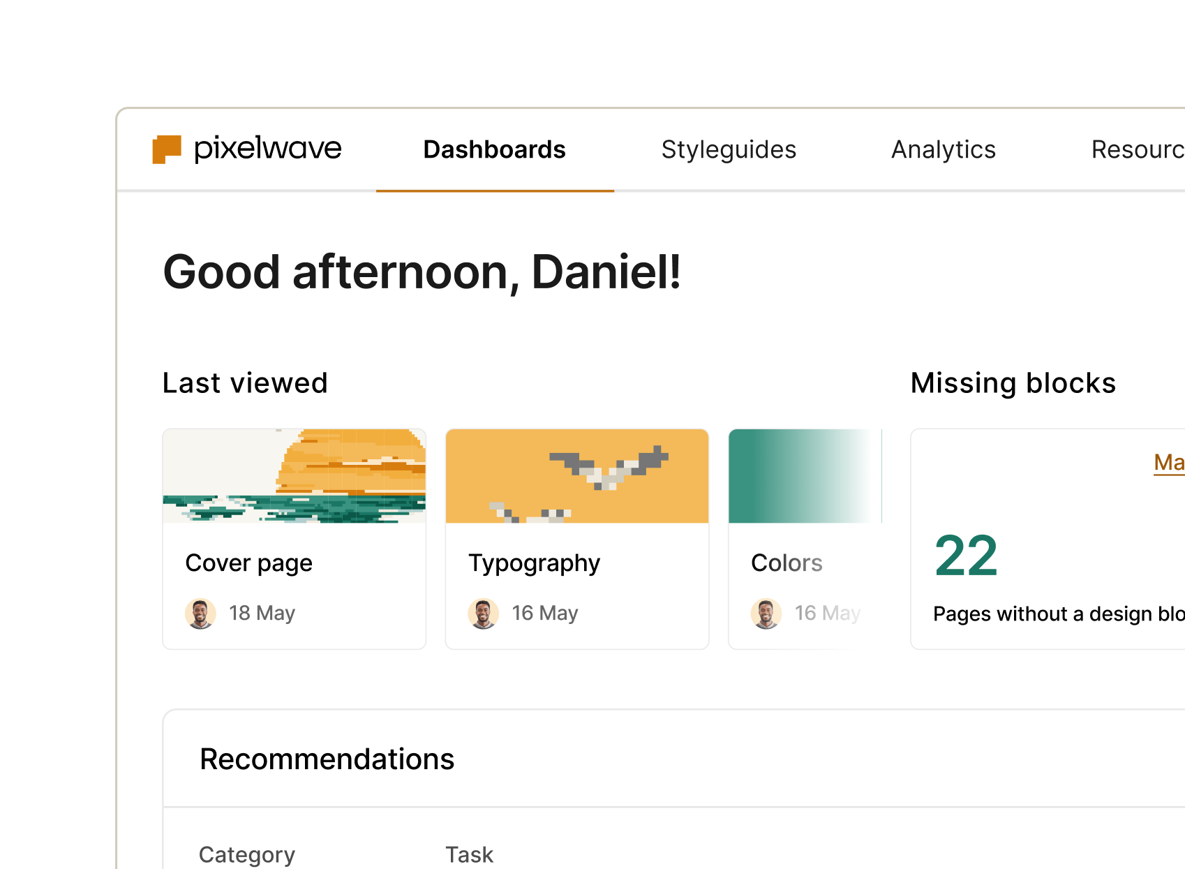
Track what's actually used
See which components are in your codebase and spot outdated implementations. Catch deprecated versions, hardcoded values, and drift before they become technical debt.

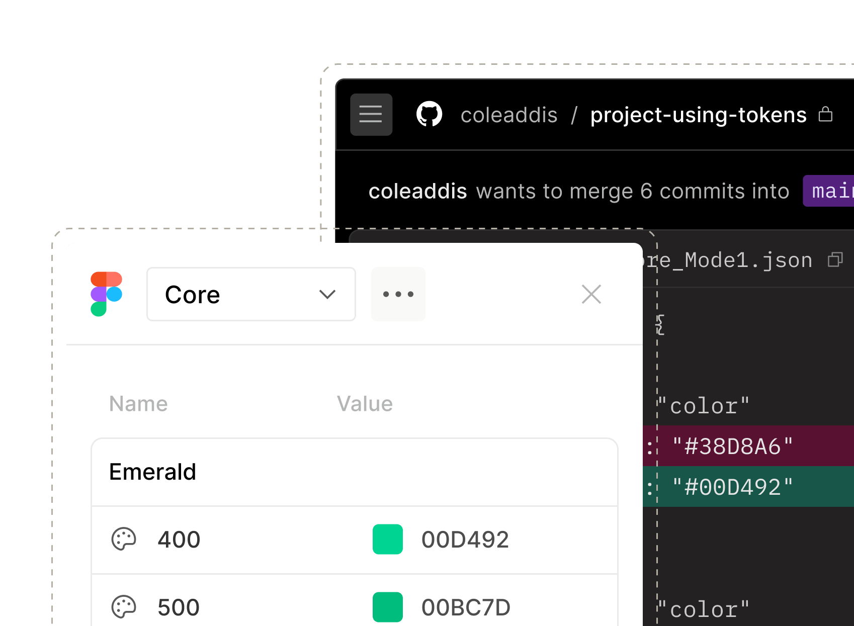
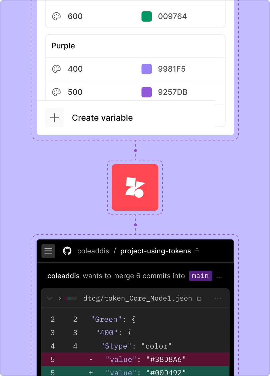
Automate from design to code
Push design tokens from Figma straight to your codebase and keep documentation in sync. The pipeline's ready — just connect and ship.
Engineering / Features
Build, adopt, and scale your design system with ease
Give your team the tools to find the right code, track adoption, and automate design-to-code workflows – all in one place.
Trusted by 20% of the Fortune 100
Your whole system in your hands
From documenting to delivering and measuring, zeroheight gives you full visibility and control — so nothing slips through the cracks and your design system keeps working like… well, a system.

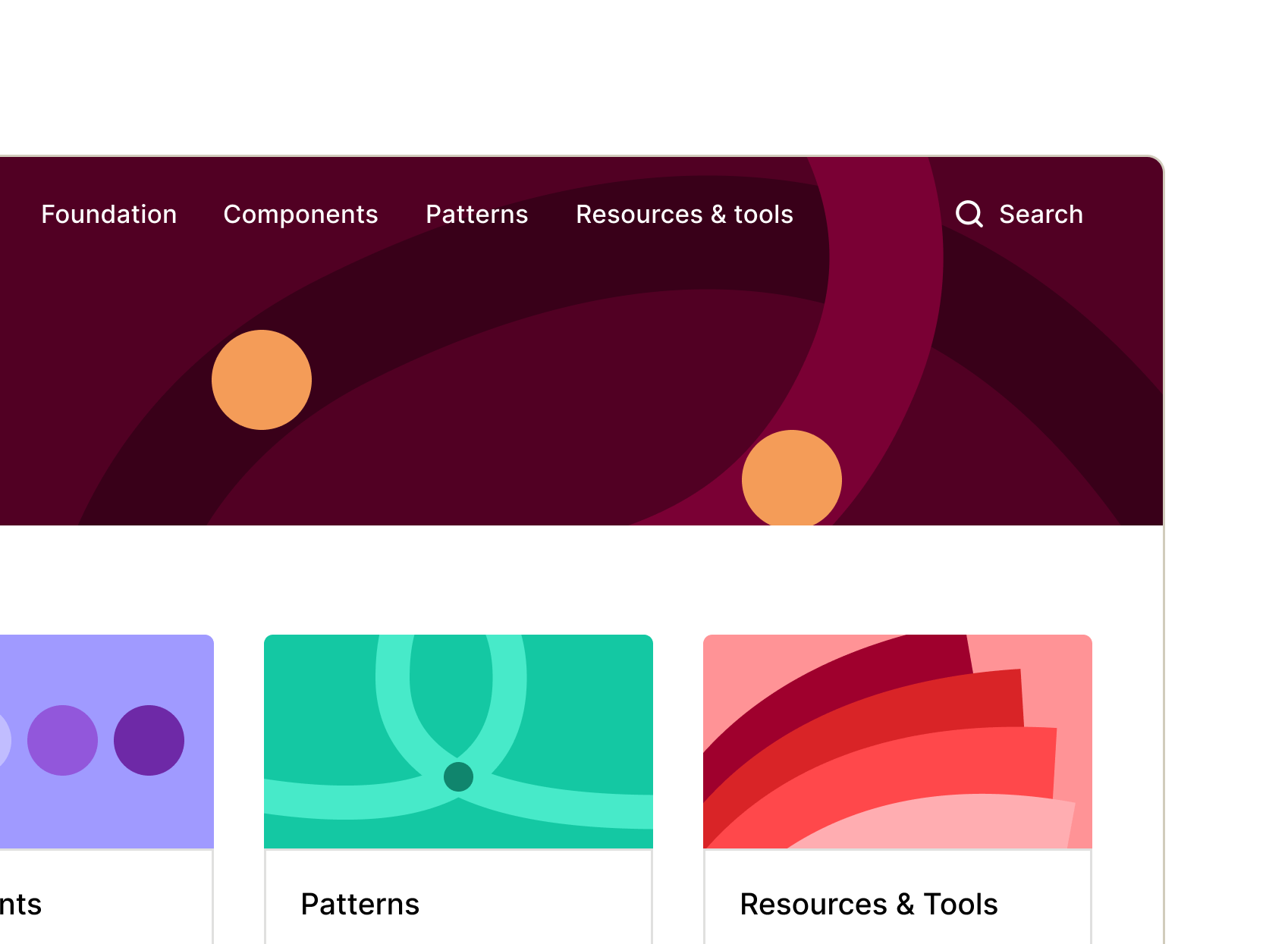
Design
Stay consistent and move faster with reusable components, templates, and automations that simplify handoff and scaling.

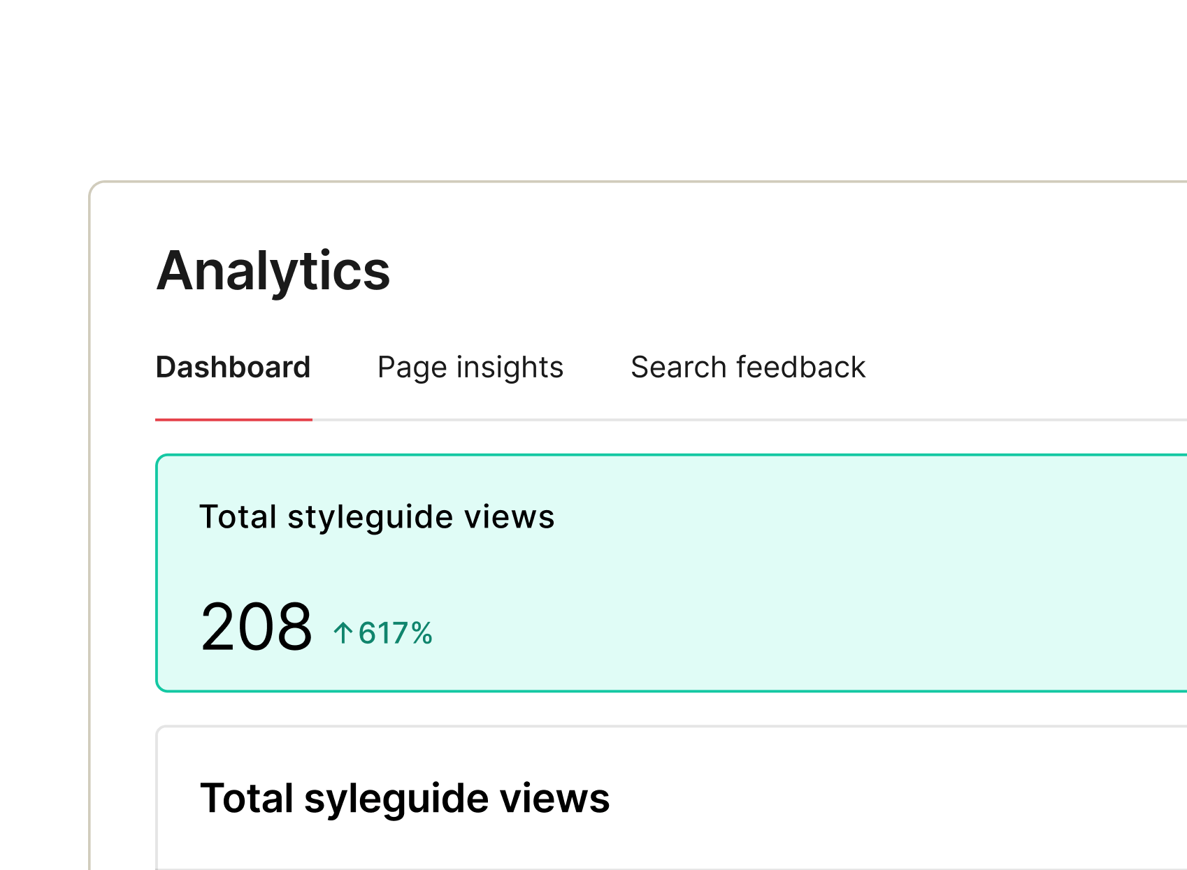
Leaders
Gain clarity and control with dashboards showing system health and adoption, guiding governance and resource investment where impact matters most.

Early stage
Kick-start your design system with starter templates, integrations, and automation to launch fast and build strong foundations.

Scaling
Scale without chaos. Keep components consistent, docs current, and adoption measurable across products, teams, and complexity.